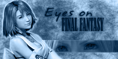
The female has 0.000000000001 cm more of the banner then the male! SEXIST!
Nah just joking its good.

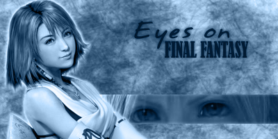
The female has 0.000000000001 cm more of the banner then the male! SEXIST!
Nah just joking its good.


I thought about giving this a shot. This is what I have so far:

azar majesty and olette should combine all thers into one and it would rock.
I really like TSoL's. It's different from most of the banners we've seen so far, so it's fresh. Using an older FF logo, as a nod to the past, is a nice touch. Although maybe as it's a banner for a FF forum, the FF logo itself could be bigger.
Olette, you may want to shift the eye more to the right. I would say that it is too offset.
Granted, I can see why it would favor staring at Terra, but.
Azaaaaar, contrast.
This is like the greatest banner ever I hope you keep it.
Another thing the banners being submitted cant extend across the whole top of the page as this banner does so well and gracefully.
Heh. Next attempt. I guess I'm overdoing it. xD
Apparently, I have been declared banished.
The reason I joined this forum was because of the Classic Blue Style. The brown style is so typical of every single other Forum out there. But when I came along and found this site, they had this funny little banner that didn't fit the width of the forum, and I thought, "well that's cute" and ta da! I like how having a smaller banner gives the forum a sort of old school charm.Originally Posted by lovehurts

That's the banner for the EoFF 2005 style and it's not going to be changed. The banners in this contest are for the EoFF Classic style. (to change style, use the drop down menu in the bottom left corner)

Any better?
Edit: Gah, uploaded the same one twice. XD I have two many blue banners saved. Anyway, that's the newer one.

Cool Im in classic mode now thanks.
Yah it is better olette.
Okay and thanks for the advice.
Larger Font:
Darker version:

>>> Why not?..

>> The black orb glitters ominously... but nothing happens..


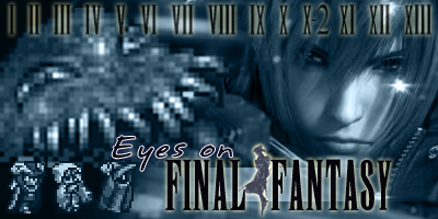
Ultros is a little pixelly for my liking, but I like the concept of this one alot~ (replace ultros!)
I like it , its the most different of them all and it would be a good change.
 Posting Permissions


 Reply With Quote