I really really like ValkyrieWing and Zeldy's entries.


I really really like ValkyrieWing and Zeldy's entries.
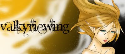
ValkyrieWing's is particularly amazing.

Valkriewing had better gain immunity this round, that is all I have to say. She used a theme that was fun and fit The Post perfectly, and showed a level or professionalism and artistic qualities that ought to have her scores show as such.
Also, well done to the other contestants, I can see that some of you are definately growing throughout this competition.
...


Nominus, I LOVE you! XD But I still think yours is better, and Mum's is probably the best. Everyone did a fantastic job!Originally Posted by Nominus Experse

Last edited by ValkyrieWing; 08-30-2006 at 01:58 PM.
~Ye must desire respite from thy empty existence. Thou shalt have it.~
I didnt have time to do an awesome drawing but if you want to take the idea and slogan and evolve it into something more artistic you are more than welcomed to do so. I may have lacked with a drawing but there is nothing like a good slogan to make people remember your product. Art in a product is by the millions, there are millions of products with art in them a good slogan now that is rare.A good slogan with good art that's even better....
I didnt have the time due to my buisy college schedule to make an awesome drawing. The slogan I came up with in seconds. I was sort of disapointed that I didnt see any more creative themes or slogans but atleast the art was good for the rest of you.
Very creative work to all of you.
Tan are these all going to be computer art contests from here on through?
No. The next challenge has to do with MS Paint, but it's not anything complicated, and drawing clothes, which shouldn't be too hard, either. I think that... hmm... I've seen how difficult it is for some of you, considering you're not too computer-savvy (did I use that right? xD). I'm pretty sure there are no more computer-related challenges (banners, sigs, or anything like that) from this point on :)

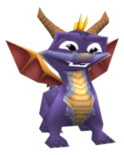
just for every one to note:I had 1 day to do my banner! i focused mainly on vivi and he took quite a long time,if i had the full week like everyone else im sure i would have come up with something better.
And thanks Psycotic.
Ive never drawn Tifa in my life. Thats why It dosn't look like her. I don't do cartoons xD
No way! I'm with Nominus on this one - your's eclipses the rest in my opinion. I truely hope this banner is used from now on. Excellent work!
[QUOTE=tan;1860376]...(except for Mum's, considering I have to e-mail it to the judges because it's a PDF file)
This is what it looked like - and I've attached the the drawing too. As I said before, graphic art is my weak subject (along with landscapes!)
Those are all great. I like #3, I don't know why it got such harsh reviews.
O_O
That means a LOT coming from someone as spectacular as you...
~Ye must desire respite from thy empty existence. Thou shalt have it.~
I'll call koyasuslave...one sec.
~Ye must desire respite from thy empty existence. Thou shalt have it.~

The standards shown for this challenge was very high..
Str8 Pimpin'
I've got all the scores, everyone. You all did great! But first, let me post Zeromus_X's banner and reviews (and Mum's other review from koyasuslave).
Zeromus_X:
"Good:
- I like the eye motif, and it ties in with the "Eyes on" theme.
-The Black Mage and White Mage drawings are cute. I like them.
Bad:
- A little bit too simple.
- Colours aren't bold and bright - it doesn't grab your attention."- Psychotic (thank you very much Psychotic :D)
"It's cute and chibish. Is chibish a word? Vivi is adorable and the White Mage looks like a kitten because of the way the hood sits on her head. The eye is very wicked looking with those spiky eyelashes. It has some decent colours and the newspaper is drawn quite well and looks realistic. I like the writing. All in all it's a good drawing, but still needs a lot of polishing."- Leeza
(thank you very much Leeza :D)
"I don't know this persons name, so I have dubbed it "Nanashi's Banner" aka the Vivi and Garnet banner. Simply because it's freaking hilarious! I have a weird sence of humor, and I am rolling on the ground everytime I see this pic. But the reason why I didn't give it a higher score, was because it blends in to well with the crowd. I see the banner, and laugh out loud, but I would have to really look for it, if it was ever in a "crowd". The coloring is great, but it could be a bit brighter. I love it anyways! I also want to make this into a icon of some kind, lol."- koyasuslave (thank you very much for doing this, koyasuslave :D)
Mum's last review:
"Once again no color. I'm big on color. Art is beautiful, I have no problem with pencil drawings. I must stress this again, you do use black and white, to advertise, black and white. I love the art! I want to put it on a Icon someplace, but it's just not ment for a newspaper. Gomen nasai."- koyasuslave :D
Now, to announce who won...
I would like (SPOILER)Nominus Experse, Zeldy, ValkyrieWing to step forward. If I did not ask you to step forward, then your scores have qualified you to go onto the next round. Congratulations.
(SPOILER)Zeldy- Your piece was very well-drawn, and your use of graphite was very well-done, as was the text. One judge thought it was TOO conforming to the Post, but other than that, it was great.
(SPOILER)Nominus Experse- Your banner was well-drawn, but it was too dark for the newspaper's style. It is your style to draw very dark pieces, but the challenge was to conform to the site and make a banner for it. Your banner would stick out if it was picked. However, yours was still very excellent.
(SPOILER)ValkyrieWing- The judges loved your banner and thought it was eye-catching, very detailed, and basically just excellent.
(SPOILER) Zeldy, you're accepted. Congratulations on making it to the fourth challenge.
And now for the winner...
(SPOILER) Nominus Experse... you're accepted. Congratulations.
This only means that (SPOILER) ValkyrieWing, you're the winner of this challenge. You get immunity for the next challenge and your banner will be featured in an article about EoFF's Top Artist in the Post. Congratulations.
Here's the scores:
(SPOILER)1. ValkyrieWing- Overall score: 9, winner
2. Nominus Experse- Overall score: 8
3. Zeldy- Overall score: 7.5
4. Mum- Overall score: 7
5. lovehurts- Overall score: 6
6. Zeromus_X- Overall score: 5.7
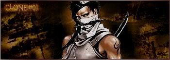
7. Clone#01- Overall score: 5.3
8. 41-inches-wide- passed on technicality
9. Christmas- passed on technicality
10. Agent Proto- withdrew, erased
Congratulations, everyone, for making to the next round. I'll post details about the next challenge in a bit :D
 Posting Permissions