Very impressive work from everyone here!


 Recognized Member


Very impressive work from everyone here!
 Hello Pika Art by Dr Unne ~~~ godhatesfraggles
Yay. =D I can't wait to start doing these when I get my scanner, 'cause then things can be more detailed and fun. *spins*

Oh, I forgot to add everyone's scores:
(These are averages)
1. Mum- 8.875 (Winner)
2. Nominus Experse- 8.25
3. Zeromus_X- 7.75
4. ValkyrieWing- 7.625
5. Zeldy- 7.375
6. Agent Proto- 7
7. lovehurts- 6.5
8. Avarice-ness- 6.35
9. Rengori- 6.25
10. Meat Puppet- 6
11. Christmas- 5.5
12. aisle_s- 5 (Erased)
P.S. I will always challenge details in the first post. Please be aware of that.
Last edited by tan; 08-14-2006 at 06:46 AM.
Wow, cograte Mum, and to all the others, good work.
P.S: Ima , you had done great, you success.
I must say I am shocked.
Oh my god.
:o
I need to be more serious about this, Ill also see if I can get to a Scanner.
Where can we find out whose picture was whose?
Also, tan, as you're going to change the first post constantly, I think it would be a good idea if you were to repost the results for each challenge as a new post in this thread, for those who are reading this when it is archived. Unless you already had that in mind, but it's always good to be sure.
Congratulations to those who have survived.
Oh, ok Psychotic. I didn't think of that! xD
I just didn't want to be bumping my own thread with the results, and I thought that that was what BoB told me not to do, so yeah.
Anyways, here's who did which picture (sorry I forgot to tell you guys xD)
1. lovehurts
2. Agent Proto
3. Avarice-ness
4. Mum
5. ValkyrieWing
6. aisle_s
7. MeatPuppet
8. Zeldy
9. Rengori
10. Nominus Experse
11. Christmas
12. Zeromus_X
I think BoB's beef was with making tons of threads. But, if he were opposed to that, I guess you could post the results from every single round in the first post after the competition has finished.
I think (or at least I hope) he won't mind me just replying the results and reviews. That would make things easier :)Originally Posted by Psychotic

Middle of the road. Not bad for a start for me. I didn't think I would do better than Avarice, but the judges don't seem to think so. Great job to everyone! I will attempt to use some color next time.
That's what I usually do when I do contests like this. However, it's usually a good idea to link to the post with the results in the first post, just so people won't have to dig the thread for the results. :P Well, I like how you're doing things in this contest. It's fresh.
Apparently, I have been declared banished.
Challenge 1 Results
As you know in the artistic world, one day you're accepted and the next day you're erased. (so cheesy, huh? xD)
I would like:
(SPOILER) Valkyrie Wing
(SPOILER) Zeldy
(SPOILER) Agent Proto
(SPOILER) lovehurts
(SPOILER) Avarice-ness
and...
(SPOILER) Rengori
To step forward.
Whoever just stepped forward...
(SPOILER) has a high enough score to move onto the next round and is accepted. Congratulations.
The other six I did not call are the best and the worst of this challenge.
The Best of Challenge 1
I would like...
(SPOILER) Nominus Experse
(SPOILER) Zeromus_X
(SPOILER) Mum
To step forward.
If I asked you to step forward you are...
(SPOILER) the best of this challenge
Nominus Experse: The judges felt as though your picture was different, but in a very good way. They also thought it was something beautiful and interesting.
Zeromus_X: You took the challenge of using watercolor, which the judges appreciated. The attention to detail with the Mom in this picture was meticulous and nice.
Mum: The judges, especially one particular judge, felt that this piece was absolutely excellent. However, only one judge felt as though the cloth in the picture separated the Mom and the baby, which is not a good thing. This judge also felt that because the two people in the picture were not looking at each other, they were distant, which is not how a mother and child should be.
(SPOILER) Zeromus_X is accepted and will go on to the next challenge. Congratulations.
This leaves (SPOILER) Mum and Nominus Experse ...
And the winner is...
(SPOILER) Mum. Congratulations. You're now accepted and have immunity for next challenge.
This means that (SPOILER) Nominus Experse is accepted. Congratulations for getting to the next challenge.
The Worst of the Challenge
(SPOILER) Meat Puppet, aisle_s, and Christmas, you three scored the lowest in this challenge.
Meat Puppet: The judges did not understand the comedy in your piece. Most of the judges thought the pimp thing was too extreme. Though your piece was funny, the judges thought it lacked detail. If you had added a bit more, it would've gotten a higher score.
aisle_s: Your piece was misunderstood by the judges. They did not like the fact that the mom's face was hidden. Most of the judges thought that the baby's eyes shouldn't have been so open or so green. One judge even commented on how it looks like "it's caught in headlights."
Christmas: The background was too distracting. They thought that a drawn background would've been better, or even a blank background would've been less distracting. There was no detail here, which the judges did not like.
The first accepted of these three is...
(SPOILER) Meat Puppet. Congratulations. You're moving onto the next round.
*adds background music that's DRAMATIC!*
Our bottom two is aisle_s and Christmas.
(SPOILER) aisle_s, you need to make sure your pictures are not safe (i.e. hiding the mother's face) and make sure they "make sense." The baby's eyes were completely distracting and the piece did not flow.
Christmas, if you had put a little more detail into this picture, it would not have looked rush. Just make sure to add more "life" into your pictures.
With that said...
(SPOILER) Christmas, you're accepted. Congratulations. You now move onto the next challenge.
This means that (SPOILER) aisle_s, I'm sorry, you're erased. Congratulations on making it this far.
As for the rest of you, the next challenge will be posted tomorrow. Now that we've seen what you can do, we're expecting more of you. Take what criticism you've received and use it to your advantage.
Challenge 1 Reviews
"Rosemary's Baby Ain't Got Nothing On This Challenge"
1.
I do like the idea behind this one, a whole happy family together.
[T]he proportions need to be worked on.
The faces need to be centered and the bodies need to be proportioned to 7 1/2-8 heads long.
The background also seems a bit... rushed[.]
This drawing does not achieve much realism; perspective is somewhat skewed, in that the woman is larger than the man even though she's more disatant. However realism may not be a goal, and what it lacks in realism it makes up for in other ways. There are little details which add a lot to the drawing, such as the light switch on the wall, the hole in the wall near the floor, the bottom figure's shirt being slightly open showing his belly, etc.
"The drawing is well-balanced; the woman's face and the face in the painting balance each other nicely, like they are two of a kind; in this case given a mother-child theme, this fits perfectly. The horizontal figure in the foreground serves to connect the two. I don't know if this was deliberate on the part of the artist, but it works.
I must also note (somewhat hesitantly) that the way the mother is sitting suggests, well, "giving birth". Again I don't know whether this was deliberate or not.
The mood of the work is of an old house (due to the nature of the lamp on the wall, the decoration of the walls etc.). I'm unsure what message this is trying to convey, but it doesn't distract me from the main theme of the piece.
The somewhat disproportionate face of the person with the baby is a little distracting, but given the non-realistic mood of the whole piece, it's not as distracting as it could have been."- Dr Unne
I also really like how much detail there is in the whole scene."
"The artwork itself is a bit rough and I think the baby is a tad bit too long."
"[G]ood job overall.
I like how they included [the] husband and how they showed us all at play.
[I]t looks like a younger, inexperienced artist drew it.
I'll give them points for what I did like. Like the inclusion of the whole family, like the home setting.
[S]kill level seems very juvenile.
2.
This drawing is simple, but I like it.
I think my favourite part is Sammie[.]
I like how you formed the faces and the features.
[Y]ou should have used have used more shading[.]
Without the shading, the drawing seems a bit flat[.]
Very clean very simple. I think the expression on SammieBabe's face is really great. The baby's expression seems a bit off though. Good stuff here but I think it needs a bit more fleshing out.
This drawing is a very good likeness of Sammiebabe, from the photos I've seen of her. The lines are somewhat sparse here, but the artist makes each line count, which is always a sign of a good artist: being able to say a lot using a little. At first I am wondering what it would have looked like with color, but I think that leaving it without color is actually just as effective in this case.
The mood here is "Behold my baby!". "Motherly pride" is what I would call this, if I had to name it. The mother looks somewhat dishevelled, as though she was caught at a random moment in the day and asked to pose for a photo, which I like.
The baby looks less like a baby and more like a very small adult; it's probably something about the proportions of the face. I find this somewhat distracting. It's easy to concentrate more on the mother than on the child, in this piece.
Like the happy feeling of the picture.
Babies smile is precious.
Would have been better with color.
3.
[I]t really stood out to me.
[Y]ou drew Sammie really well.
[H]er features and her arms outstretching especially are very nice.
What attracted my eye was the lightning on Sammie, especially her shirt and face, which was done very well.
[T]he small details on the crib toy are nice.
The crib kind of seems flat[.]
I think more details to show each side as seperate, rather than one long area would have helped it out a lot.
I think [the background] could have been done a little better as well[.]
I like the coloring in this entry. The baby doesn't look so much like a baby but more like a miniture sized kid. I like the whole nursery scene but I think the actual people in the drawing need to be worked on.
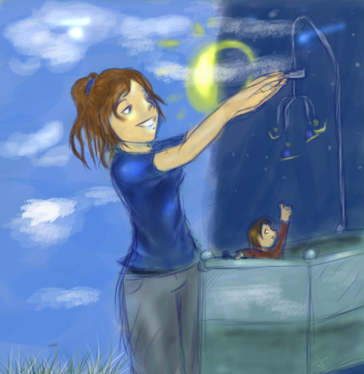
Blue is clearly the dominating color here; I'm not sure it's the best choice, because it gives a very somber tone to a theme which should probably be joyful. In the background is a light which is mostly eclipsed by darkness; again, not a joyful thing. On the other hand it could be interpeted as a light EMERGING from behind a darkness, in which case it does fit the theme of "new birth" well.
My immediate impression of the mother (also in blue) is that although she's smiling, it's an ironic smile; this is probably not what the artist intended to convey, but it's my first impression.
There is a nice connection between the color of the mother's hair and the color of the child's clothing. However there is a lack of contrast between the mother in blue and the blueness of the rest of the piece. Some kind of bright vibrant color would probably have added a lot to this piece.
The technical skill of the artist is apparent; the hands are elegant and convey a sense of a light touch. The facial expression of the mother is one of relaxation and contented attention, which is pretty much perfect for the setting and comes across strongly. The child is small enough that not much detail could be added; in fact I think the child could probably have been drawn larger, if only to show more detail. The child is almost lost in the photo due to the small size.
Little details like the unfocused clouds in the back and the very detailed grass add a lot to the drawing.- Dr Unne
Good use of color, and the switching to bedtime is cute. However, more attention the detail of the actual family pics.
4.
The features in this piece are very soft and beautiful[.]
[T]his is one of the few where the baby really brought out in the piece and made a main part[.]
The baby's expression is my favourite part[.]
The shading is superb, especially on Sammie's forehead.
Even the towel, though I think it would have come out more realistic with more folds (I'm really grasping at details here), came out nice with the shading.
Sammie's face is a bit too much on the right (I think that from the way she's holding and looking at the baby, it would even more leftward)[.]
[T]his piece is really excellent.
Amazing! Absolutely brilliant. I love how soft this drawing is. It's almost like it glows. The shading is fabulous. The baby and the mother both look great. Fantastic job.
Amazing detail, very accurate on the faces, great job shadowing.
This drawing goes for realism and does a very good job of it. The first word that comes to mind is "softness", not only the cloth that is enclosing the child but also the people themselves; this fits the mother-child theme very well. Although not pictured, the impression is of a mother lying in bed with her child, probably with the child in the mother's embrace.
The second thing that comes to mind is separation, in that the child is distinctly cut off from the mother by the white "void" of the cloth. This takes away a certain sense of "closeness" that would otherwise have been present. This is also emphasized by the mother not looking at the child, and the child being unable to look at the mother. I would've liked to have seen the mother looking downward to the child. However a resemblence (and therefore connection) between mother and child is evident in the eyes and their matching smiles.
The expression on the child's face is borderline "slyness". The child looks too intelligent to be a child. However the more I look at the drawing, the less this impression comes across.
In terms of [technical] skill, it's obvious that the artist is very skilled and the piece is technically very strong.- Dr Unne
5.
In this drawing, the child is almost smothered in the embrace of the mother, which I think works well. My second impression however is of the near-perfection of the features of mother and child; when I think "mother" I don't think "perfect statueesque beauty", rather I think "soft natural beauty". This woman does not appear to be a "mother" to me, mostly because of her perfect facial features and especially because of her perfect figure; definitely not something a mother has shortly after birth.
The bursts of color in the background are a wonderful choice and add a lot of emotion to the piece. The contrast between the color of the woman's skin and the child's skin emphasize the child's youth and tenderness/vulnerability. The mother's attitude toward the child is one of loving protection, which I think works very well. The toy in the mother's hand brings back many memories of mothers I've seen in this very position, lugging around a toy to keep the child happy.
The technical skill of the artist is quite apparent in the excellent use of line and color.-Dr Unne
Very cute, felt somewhat cartoonish, Again attention to the actual family pics and details like eye color would have been good. Like the "Earthy Mom" comforting feel of it.
This is a wonderful piece of art. The coloring is especially great. I'm not sure that it's a good representation of SammbieBabe and her baby but the art itself is good. I like the little touch with the stuffed mog.
I really like the colours[.]
[T]his one has the details that I'm looking for, particularly in the colour, like the yellowish glow on Sammie's hair due to the lights.
The folds of the fabrics, the colours in the dress, and the moogle toy really caught my eye.
The expression of this piece is very beautiful, this is another piece that really brings the baby out as a main part, rather than a small character in the drawing.
[E]xcept for perhaps the right (our right, it'd be her left) arm needing to be a bit longer, there is not much that needs improving.
Very great job.
6.
You've used color and shading very nicely.
The folds in the fabric were done well.
The coloring in the fabric of the shirt is pretty good.
Good effort but it falls short.
Very stoic. Would have liked more incorporation of Mom. Baby looks like its caught in headlights.
The first thing you can't help but notice here are the eyes. They are strikingly bright and almost piercing, right in the middle of the piece. It makes me think the child is terrified, which is probably not what the artist intended.
The mother's features are mostly absent, which leads me to focus almost exclusively on the child. I think this works well.
The colors of the mother's clothing vs. the childs blend nicely, giving this drawing a sense of "silkiness". The baby's skin is pinker than the mother's, but also paler, giving the child an almost sickly look. Again I'm pretty sure this is not what the artist meant to convey.
Neither mother or child is smiling; there is not a lot of joy here. It's more as though we're looking at statues of mother and child.
Overall the piece ALMOST works; very small changes to just a few details (the eyes, the mouths) would have made this a very effective piece.-Dr Unne
7.
This one made me smile[.]
What an interesting entry. I like the representation of SammieBabe, but the whole pimp baby this is just a little too off center.
The idea behind it definitely gets thumbs up from me[.]
The baby is really great, he's such a pimp!
OK, I think the baby looks like a pimp. Let's just get that over with.
Given the fading out of the mother in the back, this picture gives the impression of a mother sitting for a photo, a child sitting for a separate one, and then the two photos joined together later. Most other pieces have shown mother and child together, which I think is more apt.
The baby's pose (calmly standing with his arms behind his back) is not the pose of a child. If not for the facial features, it would be difficult to know this is a child at all.
The technical skill of the artist is apparent in the realistic positioning of each figure's body, and the subtle but accurate facial features.
This piece gets points for originality. I feel like I may be missing something here.-Dr Unne
I think more details in Sammie, just a bit of light shading, and some color would have really made this nice.
xD Anyway, very comical, despite lack of detail, artist did study the subject pics.
8.
The artist obviously tried hard to study the subject pics, like the closeness of mama and baby, skill level needs to be improved, but good effort.
[T]he colours and shading of Sammie's face are nice.
The shape of Sammie's face on the left needs improvement, though the right side is nice because of the nice shading and lighting.
The details that went into Sammie don't really seem to have gone into the baby as much.
I think the SammieBabe part of the drawing is pretty great.
The first thing I notice is the child's hand grasping at the mother's shirt. This little detail is a perfect representation of mother-child; that's exactly what babies do.
The somewhat oversized ear of the child gives it an awkward and aptly baby-like appearance. The features of the mother convey a sense of pride.
The mother appears to be somewhat older than Sammiebabe actually is, but I don't think it takes much away from the piece. The mother in the drawing looks decidedly natural and very human.
It's difficult to get a good sense of the colors in the piece due to the poor quality of the scanning, but what I can see is good. The red of the child's clothing draws your eyes immediately to him. The vibrancy of his clothing in contrast to the mother's lighter, more subdued blues gives an impression of the strong energetic life of a newborn child.
Technically speaking the woman's face is slightly skewed (though again it's hard to tell if this is from the scanning or is how it was drawn), but the position of her arm has a nicely physical sense about it. This drawing has solidness and gravity (if that makes any sense).- Dr Unne
9.
This a cute piece.
Very cute, and sweet faces. Would have liked more detail The arm placement on Mom is a little off and not supporting the baby. Shadowing is good, would have liked color.
It's nice that you used shading, especially on the neck and fabric. The features could be improved though[.]
This is one of the few pieces submitted where the mother is looking at the child; it's put to use perfectly here. The child is sleeping which is also a nice choice; again, sleeping is something that strikes me as "what babies do". Babies seem to be asleep nearly all the time.
The mother looks extremely young, I think due to the hair. Picturing a youthful mother is not a bad thing, but this mother looks almost too young to have had a child.
The slight tilt of the mother's head helps add a touch of emotion to this drawing.
I would've liked to have the child held more closely to the mother. The child looks almost as though it is being held away from the mother; I don't think the artist intended this, it's more likely due to a small technical misjudgment.
Otherwise technically the drawing is strong, though stylized. -Dr Unne
[T]he head looks a bit oblong and the eyes don't seem high enough on the face. Sammie's hand seems a bit awkward.
A nice clean image but I don't think it's a great representation of SammieBabe. I love the look on the mother's face though.
The piece could have used some light shading in the background around the two, to make the lines somewhat fade and give it a more realistic tough.
Very cute, though.
10.
Very interesting. I love the idea of displaying motherhood as something beautiful and sensual. I think the expression is a little too harsh though to suit the rest of the picture. But otherwise I really like it.
[Y]ou pulled it off well.
You used nudity in a very tasteful way.
The way you used drew the cloth that went around Sammie is lovely and very well shaded.
You also did the shape of Sammie's body well, you gave her some curves, which I like, because more often then not I see women drawn with miniscule unrealistic thighs. [T]he det[a]ils in the strands of her hair are nice.
I think the details in this piece really made it stand out for me.
Sammie's face looks a bit too sharp and severe (especially the eyebrows not really curving much)[.]
I think with the background, I would have loved to see this in a forest/autumn-ish kind of setting[.]
All in all, nice job.
This drawing takes a very different tone from all the others. The overall impression is "organic", due to the black plant-like shapes behind the mother, and the mother's near-nakedness. Interestingly the child is NOT naked, although it would probably have been appropriate for the child to be naked.
The use of color here is very good; the purples contrast with the yellows in the background very nicely.
I like the mother's hand on the child's face, and the mother's face near the child's face. Both give a good impression of a mother's love for the child.
The texture of the background and the wispy appearance of the mother's feet almost give the entire piece a sense of rising upwards. "Uplifting" works in a mother-child theme, because it feels like "victory" or "triumph".
Technically this piece makes effective use of very strong line.-Dr Unne
Love the background, love the colors. Love the goddess/mother implications. Like the closeness of mother and baby. Lacks some realism, baby is disproportionate (too small)[.]
11.
This also a cute piece, and again, I like how the baby is really brought out as a main part rather than a small addition.
I... am not really sure what's going on here. But it's an interesting way to tackle this challenge. Not really sure if this is creativity or haphazardness.
The wings are cute, and I like the baby holding the bottle.
This piece contrasts rather simplistic line drawings with a photographic background. I'm unsure the background is really necessary; it draws attention too much away from the hand-drawn figures which should really be the focus of the drawing.
The baby is suitably baby-like not only in appearance but also in pose and general attitude. The extremely oversized bottle also makes the child seem to be very small, in spite of the huge dimensions of the child in the drawing.
I like that the baby is looking up to the mother. However in general I think this may have been better without the mother even in the picture. She seemingly serves little purpose other than to exist. If I mentally picture the child sitting alone in the center of the drawing, it seems to work better on some level.
The use of "angel" to describe the child strikes a discord with myself personally, for who knows what reason. It strikes me as a somewhat overused theme. But so far as the theme goes, this drawing makes effective use of it.
Technically the drawing is rather simplistic, but it makes good use of line and color. A line more varied in darkness and width would possibly have added more life to this drawing. -Dr Unne
[M]ore details (shading, lighting, folds in cloth) should have been used, particularly with Sammie's face, because the details in her are lacking.
Like the angel wings on the baby. Baby has a sweet curiousity in its face. However, Mom looks almost male, and is somewhat distant from the baby. Would have liked the artist to have drawn the background instead of using a photo. Feels rushed.
I would not have used the photo you used in the background.
I like the idea of the baby being the main part.
12.
[You] took a challenge I admire that.
I like the colours you used, they're very soft and pretty.
Very ethereal. Very soft. I love this. The shading in the sweater is great. I'm not sure if the background adds much to the image. But I like the different colors here.
The blushing cheeks that you made are also very cute.
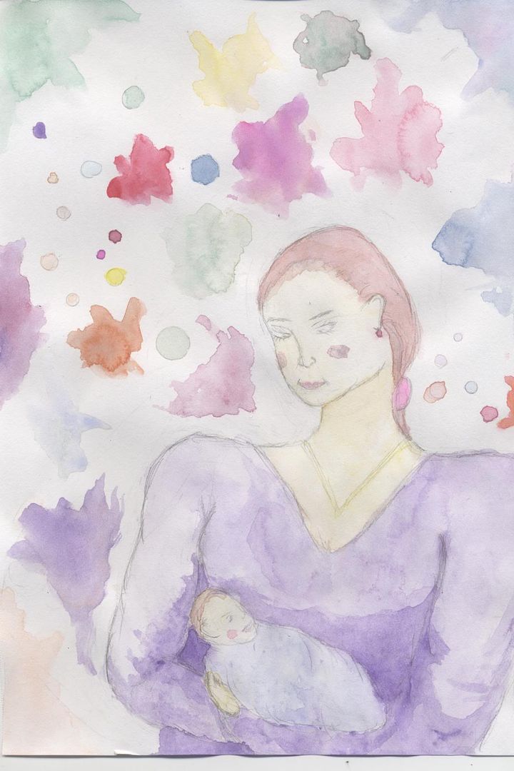
I like how you did the baby, it looks fragile and soft in the purple.
Here we have the child and mother looking at each other, which I think works very well for a mother-child theme. The mother's arms almost form a cradle, which I think also works well. The scattered colors throughout the background appear almost to be "thought-bubbles", which I find interesting, almost as though we're seeing the mothers thoughts or (more likely) feelings. Similarly, I also like the touches of color on the mother's and child's cheeks.
The mother's extremely broad shoulders give her an appearance of strength, which I think is an acceptable message for a mother-child theme; a strong mother watching over a new child. I'm unsure this was the message the artist meant to convey but I like it. The child has an almost "clueless" look on his face, which is again perhaps not what the artist intended, but suits the child fine in this case.
Technically the figures are quite disproportionate compared with real-life people, but it doesn't take away much from the overall work.-Dr Unne
The features need work...
Sammie's head is too small and her neck is a tad too long. The ear is placed a bit off[.]
Like the abstract feel, like the watercolors. Great detail on Mom. Baby seems blurred and disproportionate to the rest of the picture. Love the expression on Mom's face.
I do like the kimono, it was done well.
Nice work.
P.S. Please post what you thought about this challenge and what you think about the winners/losers of this challenge.
Hmmm.. A 6 is a failing score because is 6 = 60%.
I'll do better next time, I'll atleast want a 7.5 next time.
Yeah but I'll do better than the 7 people I lost too. =/
Last edited by Avarice-ness; 08-14-2006 at 01:29 AM.
I think that all you need to do next time is be a little intricate and add a bit more detail. You were one of the first ones to turn in your picture this challenge, and if you had turned it in a couple hours before the deadline with more details you most likely would've gotten a higher placing. I thought your picture was actually very nice, but one judge gave it a weird score, so meh :\
That's alright. I kind of rushed that one because I had just got my tablet fixed and it was the first one I did and I need to get back in the hang of things. I'll do better next time. =] Speaking of next time, when's the next challenge going to be? =D
It should be up tomorrow! I would start on it right away, but I need to work tomorrow. I can't wait to see what the challenge is going to be!
Apparently, I have been declared banished.
 Posting Permissions