I like the 2nd one..but without the text..because somehow your text didn't blend into the words..well that's a nice sig.Your really good Good Luck.


I like the 2nd one..but without the text..because somehow your text didn't blend into the words..well that's a nice sig.Your really good Good Luck.
想要對妳說的 不敢說的愛
Sooooooooooooooo true u took the words oyyta my mouth!!Originally Posted by Polaris

I guess now i gotta keep trying to top the roxas one haha
My threadhttp://forums.eyesonff.com/showthread.php?t=91051
-3 time sigmaker challenge Winner
Too tall. Maximum signature height is 250px. Please read the Signature rules and feel free to PM a mod/admin if you do not understand them. -Rantzien
yeah it'll be hard to beat the roxas sig but Narok can do it
although i don't think that the newest ones are as good as the previous two...
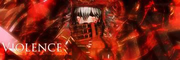
the top one is actually quite cool but without any text it's really hard to see what it is (i still have no idea btw) and it kinda makes the sig annoying and dull ...
and on the "entice" one yeah the text isn't the best perhaps but it's ok... except where the text is!
on the bottom one the corners again... not that good in my opinion... the colors are too sharp and don't fit in the corners just... quite odd actually...
now don't get me wrong the sigs are awesome all of them
=====>Check out my sigs!<=====
2 new ones from me
A quick to warm myslef up
A serious attempt by me though it might still require some work:rolleyes2
More to come!
My thread
-3 time sigmaker challenge Winner
Too tall. Maximum signature height is 250px. Please read the Signature rules and feel free to PM a mod/admin if you do not understand them. -Rantzien
Very nice.. i like how you place the images.. it is as if the images are part of the background, good work!
The Kite sig is a little..horror xD well that's to me only of course..but I like the 2nd one better..Mabe you say it still needs to be work on but I think it's a great sig..Other than the text which i dunno what it meant the whole sig is like a new style and really it's better..might be better than the Roxas one
想要對妳說的 不敢說的愛
the two new ones are great NaroK, the second can even be compared to the Roxas sig, like XandrewX said.
although you could have added a border to the top one
hmm on the second one i can't find a single flaw except that i don't get the text... thought it was supposed to say "Invisible" but i don't know... well maybe you'll explain it sometime... practically perfect
excellent sigs NaroK
=====>Check out my sigs!<=====
I like the second one! Text could be bigger but meh!

I actually do not like the placing of the second one's text. Otherwise, awesome job on them!
2 new ones! I spent a while on each of them. Enjoy
More to come!
My thread
-3 time sigmaker challenge Winner
Too tall. Maximum signature height is 250px. Please read the Signature rules and feel free to PM a mod/admin if you do not understand them. -Rantzien
the first one is great, not my style but an awesome sig
the second one... well the background is good, the text is good, but they don't fit with the render... the render is really dark and the background very bright... it kinda clashes too much... it's acceptable i guess...but you can do ALOT better...
=====>Check out my sigs!<=====
Hmm..got to agree with Tim there...
The first one is great..I think that the border or whatever you call that is really nice..but the bg looks a little exaggerated..i guess..meh..what do I know..
THe 2nd one i had to agree with Tim again...the bg is nice but cant seem to fit with the Itachi render but the text is nice..so yeah it's nice...just the 1st one is nicer I guess..
想要對妳說的 不敢說的愛
hey guys a quick update. I just started watchin FMA (Full Metal Alchemist) only up to episode 30 or so. Anyway i came acorss the render and had to use it
Dont tell me if he actually gets his body back or not
Also im workin on a sorta different style. Enjoy!
More to come real soon!!
My thread
-3 time sigmaker challenge Winner
Too tall. Maximum signature height is 250px. Please read the Signature rules and feel free to PM a mod/admin if you do not understand them. -Rantzien
Cool!
Hey guys 3 new ones before i go lose some brain cells
Ive used a bit of everything in these. More to come
My thread
-3 time sigmaker challenge Winner
Too tall. Maximum signature height is 250px. Please read the Signature rules and feel free to PM a mod/admin if you do not understand them. -Rantzien
 Posting Permissions


 Reply With Quote