Broken Link...


Broken Link...
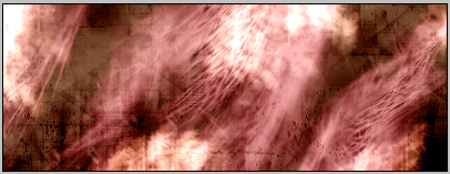
Made by me

Grr, hope this one works.
http://www.deviantart.com/deviation/...+age_scale%3A5
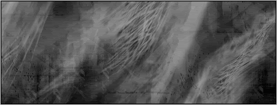
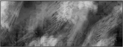
whoa, theres a lot going on in those. I see some splatters, maybe some c4ds. Not sure.

How To Make a Sig (Step by step)
Step 1: Prep
If you want to have a spiffy sig, you need to prep the images you will be using. Assuming you are using photoshop, you can render (get rid of the background, giving the illusion that the image was drawn there) the image using the lasso tool. Go 'round the parts of the image you want used, and try using the magnetic lasso as it's helpful if you don't have a steady hand. Copy the selected image and paste it on a new file that the image fits on. Save this, as they are nice to have on hand for future projects. Next, go to new and make an image the size that you want the sig. Now you are ready to begin.
Step 2: Roughin' it
Now you want to set up the image in the general fashion you want the finished product to look like. The new image should be transparent and ready to start a background on. Choose the Gradient tool to make a neat faded background look. HINT: Select the colors yourself, or choose a color from the renders you are using with the eyedropper tool. Next you need to use the move tool to drag your renders onto you newly made background. If it doesn't look right, you can always change the colors for the background. Move the Images around to see what loos best and try to edit the gradient to make it emphasize the images used. Now, you should be ready to move on to Step 3.
Step 3: Prettifying
This is where the brushes and texts come into use. There are many preloaded brushes that will work nicely with whatever you are making, however you can fine tune them if you wish. A good rule of thumb when using burshes with color, is to create new layers to put them on, so that if you mess it up, you can restart without having to delete all of your work. When You've finished that, move to text. You can use the thext tool on any layer and it will make a text layer. To use it, click and drag the cursor to create a text box, then start typing. If you are typing over images, it is difficult to get the color right, so if you need to, you can use a different color for each character.
Step 4: Are you done?
This step is for if you want a border or editing. Bording looks nice on some sigs, but not on others.
Step 5: Saving
This is one thing that can be a pain. Getting the right filesize for EOFF. You don't want to sacrifice quality for image size, so try to use .jpg on the max setting (usually 10). If you are going to print it out, you should save it as a .png as it is usually the best image quality.
Step 6: Congratulations
If you are like me, you'll want to show of your spiffy sig by putting it online or showing on the screen to friends or family.
I, by showing my step-mum on of my images, got her to pay me for creating ads for her business. Very spiffy money. I'm cheap, so I only charge $5 but I could charage more. If you enjoy this sorts of thing, you can do it professionally as a Graphic Designer. but now I'm just Rambling, so I'll go away for now.
Question here! Just wondering how people make the rainbow or colored filter effects on their images. I've been trying to figure it out, but I'm not really good at exploring Photoshop.
Admins or Mods: sorry if I'm supposed to out this into my other post. It's two different days, and I figured it'd be okay. Feel free to merge it though.
[leeza]Yes, this should have been an edit instead of a new post. ~ Leeza
*merges*[/leeza]
"Everything has a purpose. It's your life's mission to find yours."

Diango's guide to making a sig
This tutorial is designed to help even the newest of new out there be able to make a signature background from start to finish in Adobe Photoshop CS.
What you need:
400x150 Document in Adobe Photoshop
Default colors (Black and White. Hit the D key)
Abstract brushes, grunge brushes, whatever kind of brushes you would like to use. You can download brushes at places such as Deviant Art
Installing Brushes:
Once you download some brushes to your desktop, all you have to do is unzip any zip files you have and select all the brush files together and right click -> cut. (downloading brushes does not consist of saving the picture of them on deviantart. You actually have to click a download button). Now open windows explorer and follow the following path C:\program files\adobe\photoshop cs\presets\brushes and paste the files into this folder. Now your brushes are installed (note: you cannot install brushes while photoshop is opened. They will not show up if you try to load them).
Loading Brushes in Photoshop:
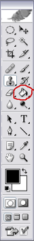
To load a brush in photoshop once you have it installed, you must open up the program. Then click on the brush tool.
Now in the upper left hand corner please click the brush selection menu.
Now click on the little arrow.
Now go to the load brushes option. Click this and select a set of brushes. They will be located in the brush selection menu.
Congratulations. You have loaded a set of brushes.
__________________________________________________________
The Project:
Make sure you have a new 400 wide x 150 high pixel document ready for work (It should have a transparent background). Set your colors to black and white by hitting the D key on your keyboard.
To start, fill your current layer with black using the fill tool.
Next, create a new layer by clicking on the new layer button.
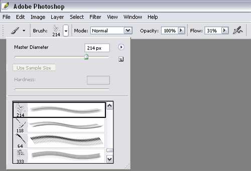
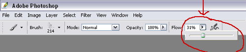
Now select a brush (using the brush tool), any grunge or abstract brush will do for the purpose of this tutorial. Now click on the flow option. This adjusts the speed at which the color comes out of the brush. Set your flow to around 50% for the first part.
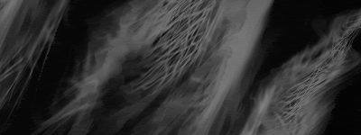
Reverse the colors by hitting the X key now. Now you are using the color white, instead of black. Now take your brush and click on the sig background (make sure you are brushing on layer 2). Only make 2-3 clicks in different spots. Your sig should look something like this:
Of course you are probably using a different brush than I am, so it will look different.
Continuing:
Now create a new layer by clicking the layer button again. Select a different brush the same way we did before. This time reduce the flow of the brush to around 30-45%. Now make sure you are drawing on layer three and click a few more times over this layer. Feel free to click on top of your previous brush strokes. Do whatever looks good to you (remember you can undo anything in photoshop by hitting the keys ctrl+alt+z).
Ok. Now that that is done, you should have something that looks like this:
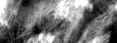
Now make another layer. Do the exact same brushing procedure as we have been using on the past layers. Select a new brush and reduce the flow by 5% this time however. Click a few more times here and there and you should have an interesting looking design something like this:
Good, you are done with the brushing part!
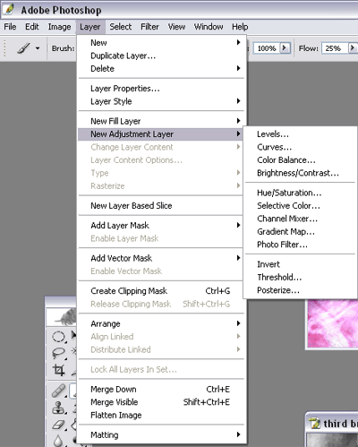
Now what we have to do next is click on Layer 4. Now click on Layer -> New Adjustment Layer -> Brightness/Contrast.
Click ok, then adjust the levels so they read Brightness:20 Contrast: 40 (or whatever settings look the best and hit ok. Now your image will look something like this:
In the next step, we click on layer 4 again. Now go back and click Layer -> New Adjustment Layer -> this time click on Color Balance.
Click ok. Now mess around with the sliders until your sig bg becomes an interesting color that you would like.
Finishing:
Now that you have a nice colored sig BG it is done. It should look something like this now:
(optional): You can add more colors to your BG by adding more of the Color Balance layers (One over each of your brushed layers. This will result in each of your brushed layers being a different color.) In order to do this, all you have to do is repeat the color balance layer step, but place one over each of your individual brushed layers. If you do it correctly, you could create something like this:
You will notice that there are three different colors on the signature. You can add more if you wish as well.
You can do what you would like with it now, add a picture, add some more effects or whatever you can think of.
Here are some of my tutorials.
And another


Nice tuts, SC, but can you a bit clear the thing of pen tool, i am not getting it right?.
thanks
what exactly are you having problems with?
Well, when I use the pen tool set to path, it only select lines, doesn't drawing anything, how can I fill in the colour and how can I make the lines as smooth as yours?.
ok if ur using paths, right click, then go to stroke. Make sure youre stroking with a brush not pencil. Click stimulate pressure to make it look like its fading. Also itll stroke with whatever color youre foreground is and what ever brush youre using.
Thanks, I'll try it when I can.
whats c4d?
C4Ds are renders that are used to give effects to the graphic work.
oh right so if say i had a render of a glowing star and put it in a candle light to give it a diferent effect it wud be that kind of thing?also what does C4D stand for?
Last edited by Clone 01; 01-06-2007 at 04:15 PM.
C4D Stands for Cinema 4D, if I am not wrong.
Yeah, kinda like that, but you'll also have to use filters and such to get the effect you need. I mean, you don't just drop it on a pic and get the effect you want.
 Posting Permissions


 Reply With Quote